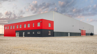
Trade shows and expos are full of opportunity. Hundreds or even thousands of potential customers are walking by, looking for products, services, and partnerships. But here’s the catch: many visitors will decide within just a few seconds whether your booth is worth stepping into. That means your booth designs can either open the door to new conversations or quietly push people away before they even say hello.
While it’s easy to point fingers at obvious problems like blurry signage or outdated graphics, there are more subtle design mistakes that often go unnoticed but make a big difference in how approachable your booth feels. Let’s look at some of the most overlooked booth design missteps and how to fix them.
Lighting That Misses the Mark
Lighting is one of the most underestimated parts of booth designs. Too often, booths rely on the default venue lighting, which can be harsh, unflattering, or uneven. In other cases, exhibitors add spotlights that unintentionally blind visitors or cast strange shadows across displays.
Poor lighting can make products look dull, signage hard to read, and even create a cold or unwelcoming mood. On the flip side, well-placed lighting can highlight your products, add warmth, and subtly guide visitors’ eyes toward key areas. Think of lighting as a storytelling tool, not just a functional necessity. A mix of soft ambient light with targeted spotlights often creates the most inviting environment.
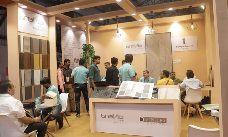
Layouts That Create Barriers
Imagine walking past a booth where tables or counters block the entire entrance. Even if the display looks interesting, that physical barrier sends a message: this space is closed off. Booth design mistakes like this happen more often than you’d think.
When the layout feels unwelcoming, people hesitate to enter. Cluttered walkways, blocked exits, or staff stationed like “gatekeepers” at the front can also make the booth intimidating. Instead, create an open, accessible layout where the entry feels obvious and inviting. Arrange furniture and displays to encourage flow rather than confinement, and make sure there’s enough room for visitors to explore without bumping into each other.
Sensory Overload
At busy trade shows, the noise level, bright visuals, and constant movement can already feel overwhelming. When a booth piles on flashing lights, overly loud sound effects, or a chaotic mix of visuals, it quickly turns from attention-grabbing to exhausting.
A common booth design mistake is assuming that more stimulation equals more engagement. In reality, too much can drive people away. Visitors don’t want to feel trapped in a space that bombards them from every direction. Instead, aim for balance. Use bold visuals, sound, or interactive features strategically, not all at once. A calm and focused environment often stands out more in a sea of sensory overload.
Ignoring Human Comfort
Sometimes, the issue isn’t about what visitors see but how they feel in the space. A booth that is too cramped, too hot, or has no comfortable place to pause can leave people rushing to get out. Even small oversights, like forgetting to provide somewhere to rest a bag or set down a drink, can cut interactions short.
Human comfort should always be part of booth design. Add small touches like breathable spacing, soft flooring, or a seating nook if space allows. Even just offering an inviting, stress-free environment can make your booth more memorable than the flashiest competitor.
See also: Best Digital Marketing Strategies for Business Startups:
Staff Placement That Intimidates
The design of your booth doesn’t stop with furniture and displays. Where your team stands and how they interact is part of the overall experience. A big mistake many exhibitors make is having staff hover too close to the entrance, unintentionally intimidating people as they walk by. Others disappear into corners, leaving the booth looking abandoned.
Integrate your staff into the booth design by giving them natural conversation zones—places where they can engage without blocking the flow. When people see an approachable setup, they are much more likely to step inside.
The Silent Message of Clutter
It’s easy to think that more materials, more products, and more signage will communicate value. In practice, clutter sends the opposite message. An overstuffed booth design makes it hard for people to know where to look, and it often feels overwhelming before a single word is exchanged.
Choose fewer but more impactful displays. Highlight your best offerings instead of everything you could possibly show. White space and clean design not only look professional but also help your most important features stand out.
Designing for Connection, Not Just Decoration
At the end of the day, the purpose of booth design is not just to look impressive. It’s to make human connections. A booth that is too bright, too cluttered, or too closed-off can scare people away before they even get the chance to say hello. By paying attention to subtle but powerful factors like lighting, layout, comfort, and flow, you transform your booth from a display into a welcoming experience.
If you avoid these common mistakes, your booth will do more than catch the eye—it will invite people in, encourage them to stay, and set the stage for meaningful conversations. And that is how you turn trade show traffic into real opportunities.